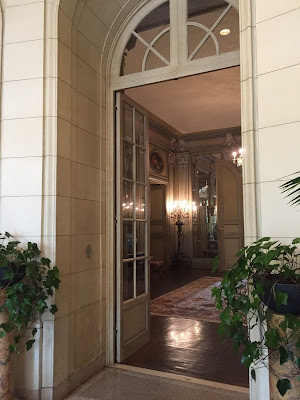
The house was designed in 1920 by John Russell Pope for Irwin Laughlin (of Pittsburgh!). The house is immediately next door to another of his spectacular houses, the Henry White residence from 1912, which currently forms a campus with the Laughlin house for the Meridian Foundation. More on the Henry White house at a later date.
One enters through a very urban paved courtyard. Things haven't changed much since 1920, those are even descendants of the original Linden trees (which they grow in the sideyard as replacements).Shall we go in?
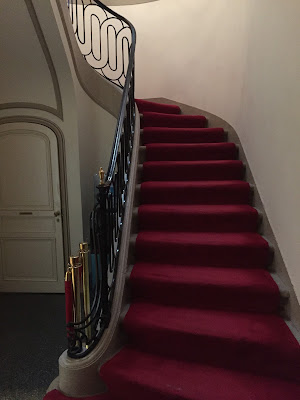
The house continues its' urbanity indoors with a piano nobile floorplan. One ascends a gracious staircase to the main level, or down a few stairs to the ground level which was originally service spaces (now meeting rooms and offices).
I think this vintage shot, taken right at the front door, shows it best. It hasn't changed at all down to the tables.
The floorplans and vintage photos in this post are all from the fantastic book, "Mastering Tradition, the residential architecture of John Russell Pope" which I have mentioned before and highly recommend. The other snapshots are all from my iphone.
The ironwork and stonework are gorgeous. I love the polished brass finial and handrail, lovingly maintained.
Looking back towards the front door. Pope followed the Louis XVI neoclassical style throughout the house unlike so many houses of the same time period which were more of an international collection of styles.
One enters the gallery at the top of the main staircase, a paneled and mirrored magical space which is the main artery of the first floor. This was designed as a house to entertain, Mr Laughlin was a numerous time ambassador, and the circulation is wonderful.
You get a sense of the scale from the other guests on the tour; not too big, not too small. One would feel at comfortable all by ones-self or in a crowd of 100 people.
I loved the detail work to the reeded pilasters. Notice they're convex below the carved leaves and concave above.
My favorite room in the house however has to be the library; like all rooms on the ground floor located directly off the gallery.
It retains the original paint finish from 1920! Look at the beautiful brass hardware too.
The doors to the gallery are hidden when closed with leather bookspines behind chickenwire.
My friend Michael Hampton demonstrates how it works above, haha. What door?!
The Drawing room opens directly from the library. Currently most of these spaces are unfurnished as they are used for all kinds of events.
As I mentioned the gallery is the spine of the ground floor. Above one sees through the gallery from the drawing room into the dining room beyond. I know a lot of architects say lining up vistas 'doesn't matter' but when it's done right YOU NOTICE. It does matter: symmetry and enfilades, sign me up!
Before heading to the dining room we'll make a stop in the Loggia or conservatory. Notice the curved end wall with views into the backyard.Looking the other way the interior wall is thickened and curved between the loggia and the gallery. We were told that the terrazzo floors were designed with those cracks in them, to appear older than they were in 1920. I'm not sure I buy that but I like the story!
Don't miss this crazy 9'-0" tall torchieres!
Another glimpse into the gallery above.
The backyard is formally paved with peagravel and Linden trees on a grid. One feels they're in Paris!
The door into the butler's pantry from the dining room is still hidden by the original painted screen but the other furniture has been removed.
The dining room's paneling was designed around the ancient tapestry above.
The lot is very long but shallow -leaving the largest 'yard' to the side seen above.
Lets step outside into the backyard and see it for ourselves now.
Notice the curved doors (and glass) in the Loggia wall.
Above is the site line from the backyard into the sideyard - such a lovely enfilade effect.
Stepping up into the sideyard you can look back to the house to see the symmetrical design of the exterior, even on the sides. Notice the false window covered by shutters; that's where the tapestry in the dining room sits.
From here one can see upstairs into the bedrooms. While they are all still in their original condition they are fitted out as offices. I think a few of the original bathrooms may have been removed but otherwise intact -it could revert back to a house tomorrow!
Before going up the stair to the upper level lets check out the breakfast room - fitted out as a conference room at the moment.
The iron railing design and stone stair is much simpler than the formal entry stair but no less lovely.
You can see this stair in the floorplan below in the lower right hand corner.
The stair is lit by a laylight and skylight above.
The hallway is beautifully preserved and features formal panelmould and painted overdoors. Rather than a long hallway it is broken into smaller spaces to nice affect.Looking back to the stairway. I don't have many photos of the bedrooms as they're currently offices -but trust me when I say they are all lovely featuring paneling and stone fireplaces.
This central space used to house Mrs Laughlin's clothing and now serves as an office to this very lucky young lady! All of the built-ins are original but obviously not the recessed lights - the one concession made to the rooms use as an office. Yes I HATE recessed lights.
The house remained in the family until 1960 when it was sold into institutional use. As you can see every owner has lovingly maintained this stunning structure.
The house is open to the public on Saturdays between 10 am and 2pm unless there is a scheduled event - make sure you visit this masterpiece here in DC!


0 Comments:
Post a Comment