Designed by Harrison Design architects, the house resembles a typical Virginian farmhouse which has been added onto over the generations. The multiple volumes help to mask the large size of the structure.
I loved the logical and light-filled floorplan. Who doesn't love a floorplan?
The only criticism I could have are perhaps the lack of program in the basement. Large open rooms bleed endlessly into each other with no real purpose. We had the idea of replacing the garage bump out on the first floor into the basement (which works with the grading) in the series of vague rooms on the left hand side of the plan below. This would also have the benefit of drawing more light into the back stairhall. But I digress......
The best room in the house is done by my friend, designer Michael Hampton. Don't just take my biased word for it, Architectural Digest prominently included it in their line up and most media coverage has featured the below image by photographer Angie Seckinger as their lead photo.
Michael was able to work with the builder of the house (Artisan Builds of Mclean) and develop many of the details of the house which may be one of the reasons the fit-out and detailing found in the house is so well done. Any talented professional designer (unlike decorator, which is a very different thing but not a negative connotation ) will add this level of finesse to any project.Above you can see the room as Michael first found it; see his blog post HERE on the development of the space. Michael designed a beautiful oak paneling to line the library, incorporating a built-in window seat and bookshelves.
The large chinoiserie painting above the sofa from John Rosselli was the basis of the room; soft greens with red accents.
The crazy beautiful sofa is also from John Rosselli and features a delightful faux bois fabric by Jed Johnson.
There are other rooms in the house worth noting, unusual as some showhouses feature one gaudy room after another - this showhouse is a comparative model of restraint!
I loved the master bedroom by Christopher Patrick. Christopher has a real talent for mixing the best of modern design and antiques to make a room stylish and lived in. These are the types of rooms in which people want to spend time! The Benjamin Moore wallcolor was especially great and I plan on copying it soon in my own bedroom. Notice too that much of the artwork are architectural watercolors by Michael Hampton!
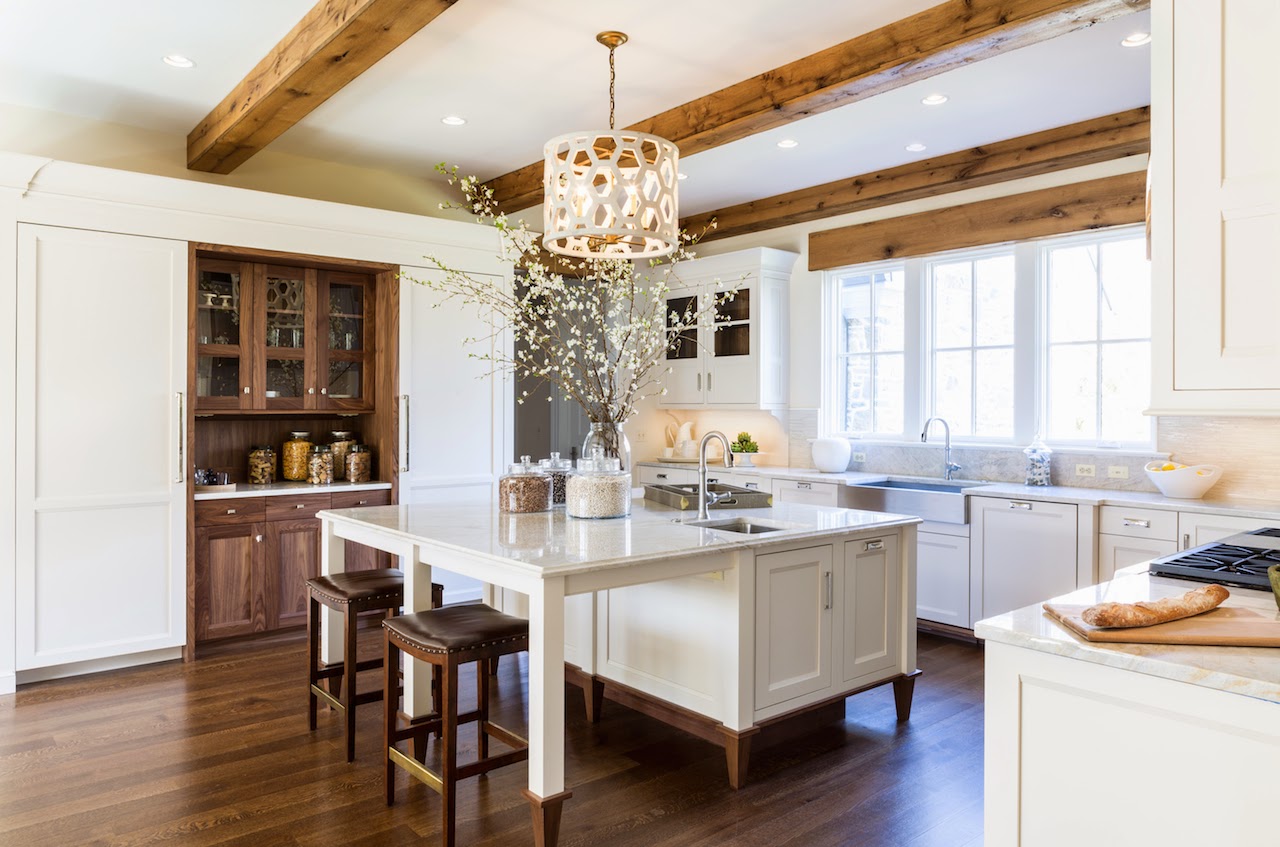
Lastly, the kitchen was a beautiful space which brought to mind a Virginia farmhouse with a sophisticated twist designed by Lobkovich kitchen design. Notice the leg details on the island -beautiful! I think they'll be getting a lot of calls from people for work on their own kitchens.
There is still time to visit the DC Design House, open until May 10, 2015 in McLean Virginia. Don't miss seeing it all for yourself!
All photos unless noted by Angie Seckinger.


0 Comments:
Post a Comment